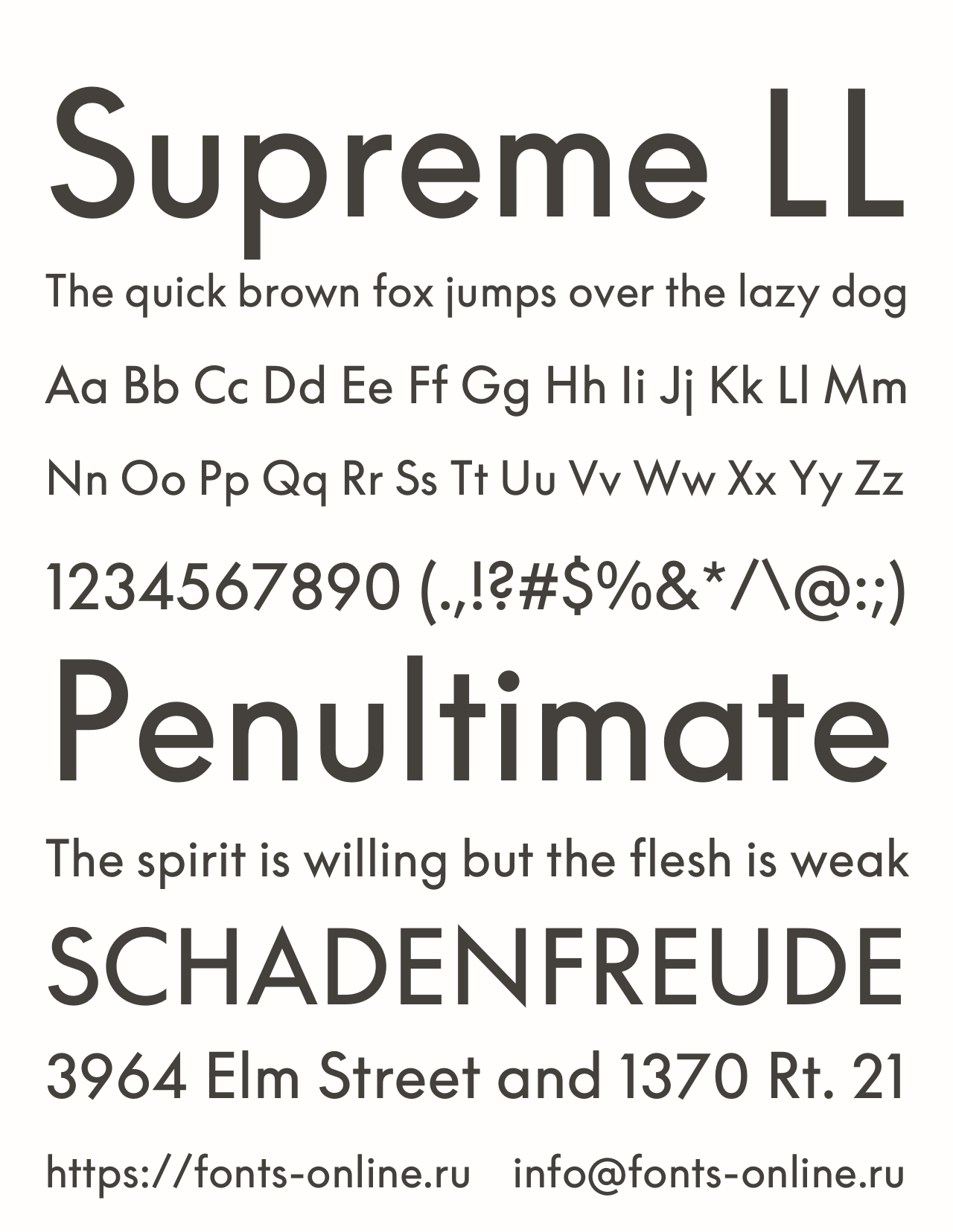
Supreme LL
Supreme LL is a variable font. The typeface contains 17 files and supports 61 languages.
About
LL Supreme presents a new take on Paul Renner’s Futura (1927). Neither a revival nor a redesign, it reframes the concept famously underlying Renner’s modernist uber classic: that a distinctive, fully functional yet sophisticated typeface could be constructed purely out of straight lines and circular curves. How, then, would this be best approached with today’s digital means, almost a century later?
Lineto’s first encounter with the Futura legacy dates to 2004, when Cornel Windlin was commissioned to art direct the catalogues and communication for Vitra’s newly-established Home Collection. Vitra had been using Futura since the early 1980s, and while Cornel proposed to stick with it, he had trouble finding a suitable digital version.
Some were based on dubious phototypesetting sources, others focused too narrowly on reproducing metal types, replicating characteristic details resulting from the limitations of long-gone technologies. Aiming at a tougher, crisper and more geometric rendering of Futura, Cornel first worked with Laurenz Brunner on a single Medium cut. This proved successful, and in the years to follow, it was developed into a range of five weights called VFutura.
Ten years later, Arve Båtevik joined Lineto as a staff designer and was tasked with overhauling the five cuts of VFutura, in order to finally create matching italic cuts. However, upon examination, Arve proposed to entirely redraw the roman weights instead. This time, no particular version of Futura would serve as a starting point. Renner’s concept rather than its interpretation would serve as a guideline, so that everything would be geometrically constructed from scratch: Futura as it should have been.
The project required a thorough understanding of Renner’s principles of construction, his method for optical corrections, and his aesthetic preferences. After comparing original drawings with earlier drafts from 1925, and with the metal types in Light, Medium and Bold crafted by the punchcutters at Bauer in 1927, Arve defined the curves for individual groups of letters, fine-tuned the joins, and found distinctive solutions for the many formal problems across each weight.
Working against the current tendency of interpolating entire families, each cut of LL Supreme was drawn separately and, as a consequence, has its own identity. In a last step, the historical stylistic alternates were added to the project, reminiscent of the font’s history and paying hommage to Renner’s daring spirit and his sense of elegance.
LL Supreme offers a decidedly contemporary take on Futura, meeting the aesthetic challenges of digital native media.
Copyright
© 2017-2020. Copyright by Lineto GmbH. All rights reserved.Additional information
Supported glyphs
Categories
Languages
